Online Grocery
POSITION: LEAD DESIGNER | TASK: UX & UI DESIGN TEAM SIZE: 3 MEMBERS | DURATION: 9 WEEKS

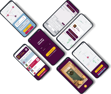
This project aimed to enhance the delivery experience for grocery drivers by allowing them to select their preferred delivery areas and avoid problematic customers. The redesigned app focuses on improving driver safety, route clarity, and overall satisfaction. My role as Lead Designer involved leading the UX and UI design efforts, from research to prototype, and collaborating with a team of three to deliver a user-centered solution within a 9-week timeframe.
Challenge
The client’s initial app provided an option for customers to order groceries from various stores for home delivery. However, the delivery provider’s experience was neglected, resulting in several issues:
Drivers lacked the flexibility to choose or avoid specific delivery zones.
Providers faced challenges with rude customers and unsafe neighborhoods.
Notifications and updates in the app were ineffective, leading to missed or delayed orders.
The main challenge was to create a system that offered a safer and more efficient experience for delivery providers while maintaining the core functionality for consumers.
Solution
To address these issues, our solution focused on three key areas:
Enhanced Area Selection: We introduced a feature that allows drivers to define delivery zones based on their comfort level, helping them avoid unsafe neighborhoods.
Customer Filtering: Drivers can blacklist rude customers, ensuring they won’t receive orders from these customers in the future, leading to a more respectful work environment.
Improved Order Notification System: A refined notification system was designed to ensure drivers receive timely updates on order status and detailed information about each delivery, reducing the chance of errors.
This solution not only improved driver satisfaction and safety but also increased order fulfillment efficiency.
STAKEHOLDERS FOCUS
Our research revealed specific concerns and priorities for different stakeholders. Based on interviews and surveys, we identified the most critical keywords associated with drivers’ needs:
Drivers: Simplifying delivery steps, safety, reducing rude interactions.
Order Completion: Clear order status updates and step-by-step guidance for drivers.
User Needs: Flexibility, control over delivery preferences, and tools to manage workload and safety concerns.
User Pain Points



Through interviews and user testing, we discovered the following pain points for drivers:
Unclear Route Information: Drivers struggled with navigation, particularly when routes were unclear or not updated.
Unsafe Neighborhoods: Many drivers reported discomfort delivering in certain areas.
Rude Customers: Unpleasant interactions with some customers led to dissatisfaction.
Out-of-Pocket Payments: Drivers often had to pay upfront for orders, leading to frustration.
Our redesigned app addressed these pain points by introducing specific features to simplify, secure, and streamline the delivery process.
PERSONAS
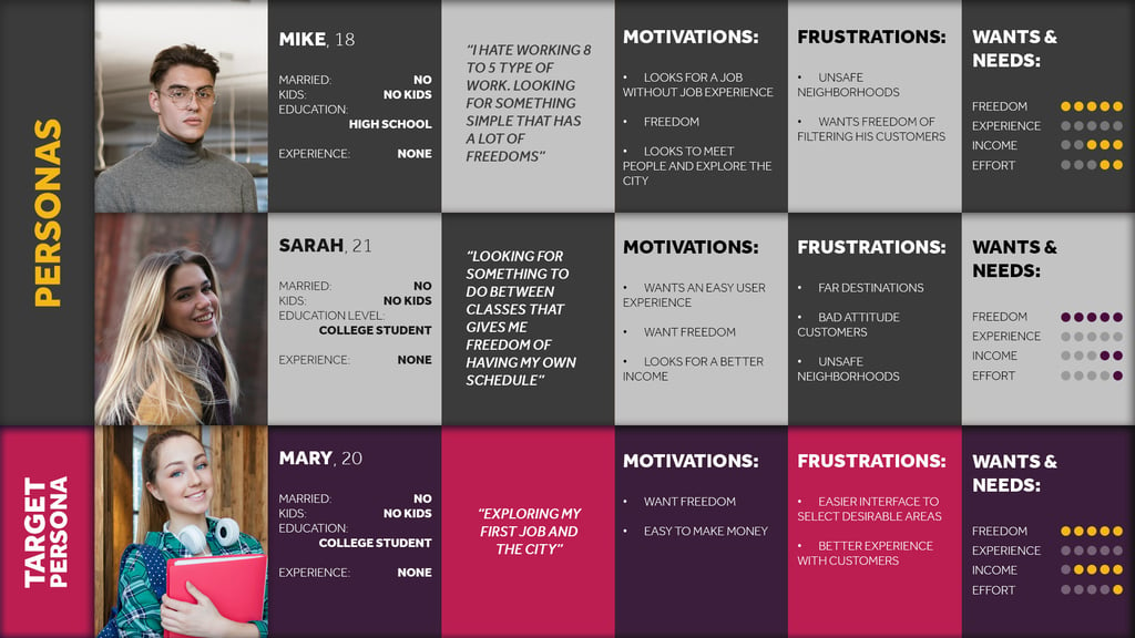

To ensure the solution aligned with driver needs, we developed detailed personas representing different segments of delivery providers. Our target persona was Mary, 20, a college student looking for flexible work options:
Mike, 18: High school graduate, looking for freedom in job choice, frustrated by unsafe neighborhoods.
Sarah, 21: College student seeking flexible hours, frustrated with long-distance deliveries.
Mary, 20 (Target Persona): First job, looking for user-friendly experience, prefers flexibility and safe delivery areas.
These personas guided design decisions and helped ensure our solution would cater to the diverse needs of delivery providers.
Design Process
User Flow and Architecture
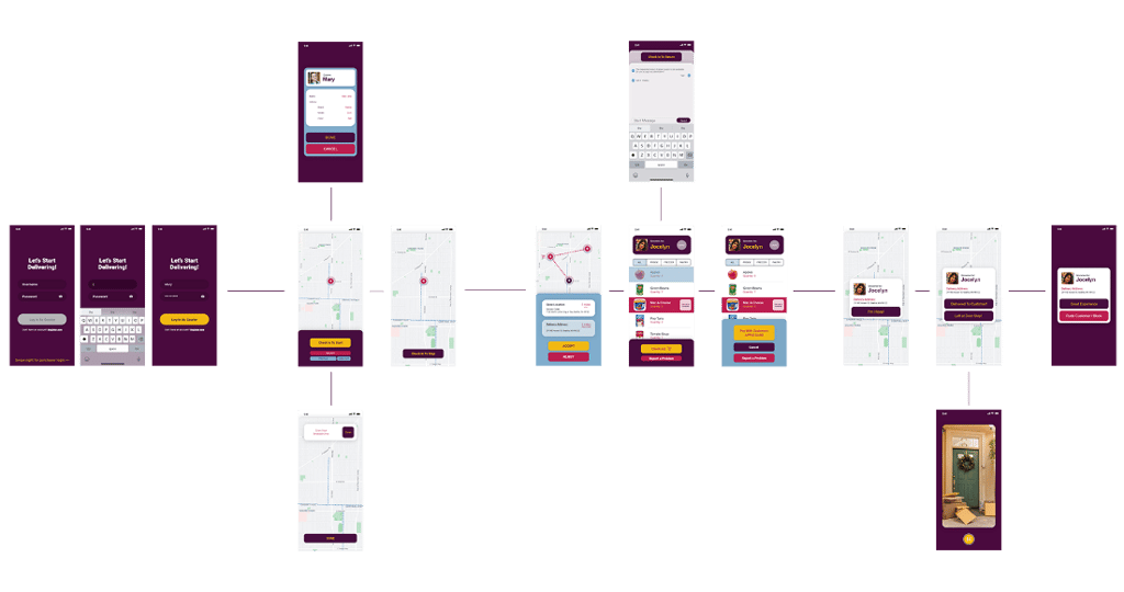
We designed the user flow to streamline the driver experience, focusing on ease of use and clarity. Key steps included:
Log In and Start: Drivers log in, choose their preferred delivery zones, and opt in to start receiving orders.
Order Notification: Drivers are notified of new orders and can accept or reject based on customer ratings and zone preferences.
Delivery Process: Once an order is accepted, drivers receive step-by-step instructions, including real-time route guidance.
Completion and Feedback: After delivery, drivers can rate the experience, providing feedback on customers and locations for future improvements.
This flow helps drivers navigate tasks more efficiently while enabling them to make choices that enhance their safety and comfort.


UI Design
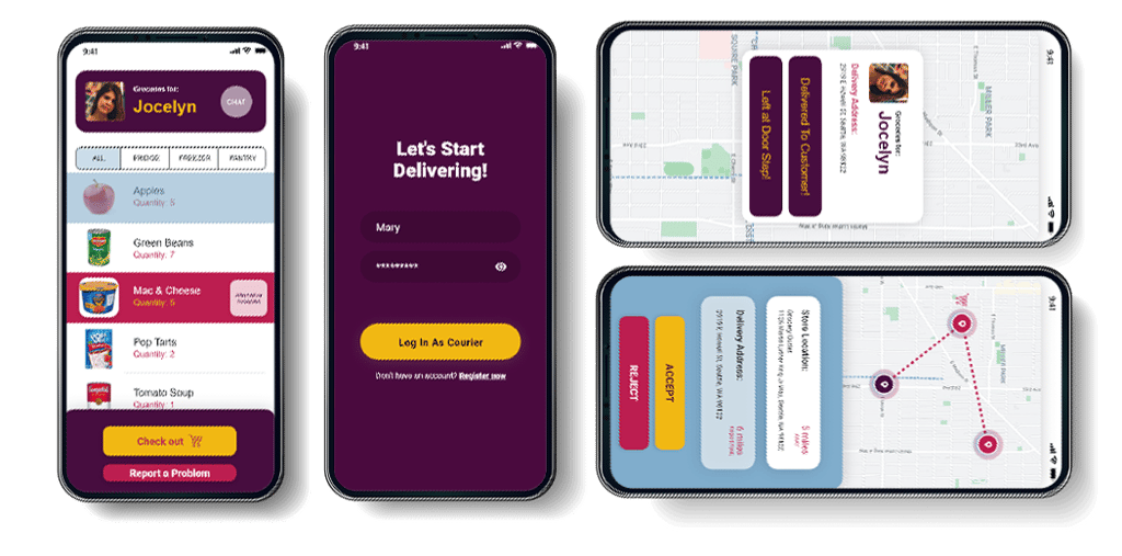
The interface was designed with driver convenience in mind:
Clear Call-to-Action Buttons: Options like “Accept” or “Reject” are prominently displayed to help drivers make quick decisions.
Location Mapping: Real-time maps show precise delivery routes, and drivers can zoom in to view specific neighborhoods.
Order Details Screen: Drivers see clear, organized order details with customer information, item lists, and special instructions.
The color scheme and layout choices emphasize usability and quick navigation, especially under various lighting conditions drivers might encounter.
Key Features
Area Selection and Filtering: Drivers set up their preferred zones and mark unsafe areas. This personalizes their experience, ensuring they only receive orders from locations they’re comfortable with.
Customer Blacklist: Drivers can flag rude customers, which removes these customers from their future assignments. This contributes to a more respectful and positive working experience.
Improved Notifications: Drivers receive immediate notifications for order acceptance, pick-up, and delivery steps, reducing the likelihood of missed updates.
Outcome and Impact
After implementing the new features, we conducted a pilot with 50 drivers, yielding the following results:
Improved Driver Satisfaction: 87% of drivers reported a better experience, with the ability to filter out rude customers and avoid unsafe areas.
Higher Retention: 65% of drivers indicated they were more likely to continue using the app due to increased comfort and control.
Increased Order Efficiency: Deliveries were completed on average 20% faster, attributed to the streamlined notification system and clearer route guidance.
The redesign successfully addressed the core issues, leading to a safer, more efficient delivery experience and improved overall satisfaction among drivers.
Reflection and Lessons Learned
This project underscored the importance of designing for user comfort and safety, especially for workers in physically demanding and dynamic environments like delivery. Key takeaways include:
Empowering Users with Choice: Providing options to select preferred areas and customers significantly boosted engagement and satisfaction.
Prioritizing Safety: Building features that consider user safety and comfort, like route clarity and customer filtering, can have a transformative impact.
Iterative Design Process: Frequent testing and iteration were critical in refining the solution to meet the actual needs of drivers.
This experience taught me the importance of addressing specific user pain points and the value of empathy in design to create practical, impactful solutions.
